Create Your First Project
Start adding your projects to your portfolio. Click on "Manage Projects" to get started


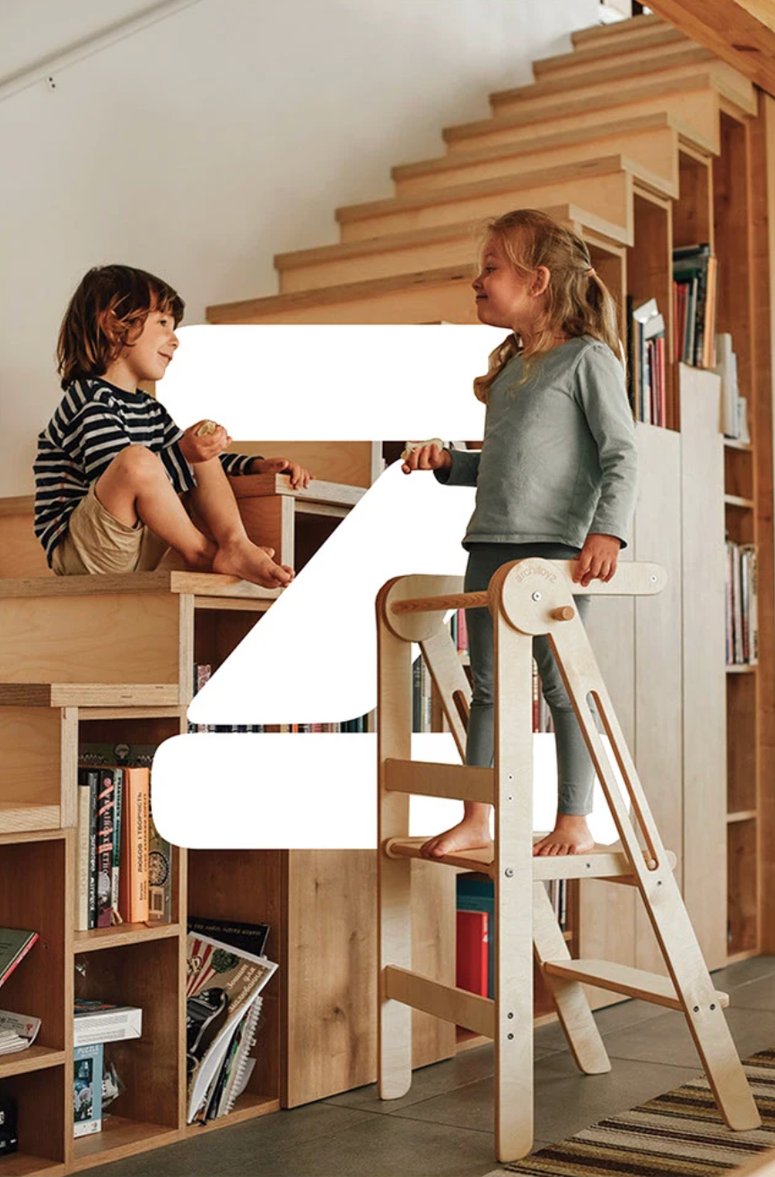
ARCHITOYZ
PROJECT TYPE
Branding, Art direction
YEAR
2020
LOCATION
UKRAINE
The architoyz identity is built on a combination of simplicity, functionality and play. The main visual accent is a bright green color, symbolizing development, energy and naturalness. It creates a feeling of a living, active environment in which a child explores the world.
The graphic language is minimalist and constructive: linear illustrations refer to drawings and the creation process, clean forms emphasize the engineering logic of the product, repeated patterns form a coherent and recognizable system The identity is easily scalable - from packaging to digital media - while maintaining clarity and functionality.